Friday 26 February 2010

Variation on a theme

I pulled out some cute gift cards I made at Convention last year with Trendy Trees  and was inspired to have a play with the same basic layout and stamp set.
I felt that this one was a little plain - in hindsight I should have trimmed the white cardstock so there wasn't as much "white space."

The next one was a little different:
Again, same basic layout, colours and stamp set but a totally different result.  I added a bit of subtle background pattern stamped in Versamark, used the spiral punch along the edge, a bit of hemp twine, and I was done.  I quite like the way this turned out.  

Last of all, I used the SAB set you can earn for FREE, "Good Neighbours."


I stamped a subtle background in Versamark and used the same layout as before.

I really like this card!  Which do you prefer?

Wednesday 24 February 2010

A Happy Hello

I made this card for a lovely friend, as a "just because" card and I was pleased with the way it turned out.  Nothing too tricky or flashy here.  Just cheerful bright colours (dictated by the Washington Apple DSP) and the sweet "Hello Again" stamp from the Summer Mini.


I stamped the flower 3 times - once in Kiwi kiss (for the stem and leaf), once in Real Red (and I cut out the flower and adhered with a Dimensional), last in Pumkin Pie (cut out the middle and popped it on with a dimensional).  I like the "3D" effect popping up layers gives to an otherwise very simple card.   At the last minute I pierced the row above and below the flower using the Mat Pack.

Hope you are having a happy day too!

Wednesday 17 February 2010

Scallop Circle Punch Flower Embellishment

I made some pretty flowers to embellish some of my tags and thought you might like to see how it was done.  This is not a technique I invented, although it has been around in various forms all over the internet for years, and is similar to Dawn McVey's distressed flower embellishments.

You will also note the first few photos are blurry and not in focus, and then suddenly I notice the little flower thingie on my camera (Macro) and Shazam!  I have details in focus!  Sadly you also have a close up of my dreadful fingernails with the peeling off nailpolish and bitten down nails.  Not pretty.

Anyhoo!  Here's the flower you will learn how to make:

First I punched a scallop cirlce from scrap So Saffron Cardstock that I'd stamped with the En Francais Background stamp in So Saffron ink for a subtle, vintage look.


Next, I crumpled it into a ball.  Yes, really! (Note the blurry pre-Macro photo!)


Then I smoothed it out and roughed up the edged with my thumbnail.  You could use a pair of scissors, but I found it easier to use my thumbnail.  You want the edges roughed up like this:


So you can "split" the cardstock layers on each scallop with your fingernail, and gently roll them.  Notice the in-focus shot now?  Don't look at my terrible nails!


Next I inked the edges in a shade darker ink than the cardstock (More Mustard).


Now the easy part !  (Not that the earlier part was exactly difficult)   Using some retired Earth Elements buttons I'd been hoarding, I poked a hole in each buttonhole and stitched the button to the cardstock using linen thread, and tied it in a bow.  A knot would look just fine as well.


Finally, taking my super sharp Paper Snips, I cut between each scallop up to the button to make the petals.  Easy!


And there you have it!  Your own lovely embellishment made entirely from scraps.  


Try it yourself!

Saturday 13 February 2010

School Fete

I'm working with a talented group of Mums at our children's primary school to make things for the school Fete later this year - we want to get a start on things now, and we are all feeling quite energised and inspired!

I'm also excited because two of the ladies in the group (Leanne and Michelle) are actually famous Scrapbookers (Squeee!) who are published and everything!    I feel like I've met papercrafting royalty, LOL.  They are both incredibly lovely as well as talented - click on their names to go to their blogs.

Leanne started off by making some gift tags, and asked me to make some too.
Hers are divine, and you can see them here .

I've used the same dimensions, but instead of double-sided patterned cardstock as Leanne did, I've used scraps of plain cardstock and stamped a pattern on them.    The idea was to use scraps we already have in our scrap card pile, and I have plenty!  I have a few more to make to catch up to her, so I'll be working on them tonight no doubt while watching tv.
I took the photo with my iPhone, so apologies for any quality issues.
Here are mine:


Friday 12 February 2010

Some more decorating ideas

I found these inexpensive frames at Spotlight, ages ago and bought them without a specific project in mind.

Last week, I finally dug them out and this is what I came up with:

This was made using the Urban Garden DSP and Butterfly Punch (Summer Mini).


This was using a retired Hostess set and current Hostess set "Echoes of Kindness" with my favourite quote.

Wednesday 10 February 2010

NSR (Non- Stamping Related) Post

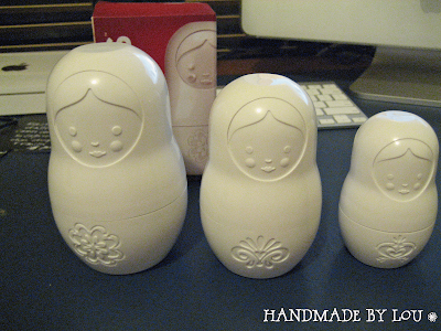
I just had to show you guys the cutest ever measuring cups I found while browsing at a local shop (Mumma's Place at Newmarket) -

Russian Dolls!  Could they be any cuter?  They nest inside each other of course, and the top half of each doll is a different measurement to the bottom - one is 3/4 cup, the other may be 1/2.   They cost about $20 and I couldn't resist.
 Here's the packaging to help you find them.
*disclaimer:  I am in no way affiliated with this product.  I just liked it.

Tuesday 9 February 2010

Working With Strong Colours


I love colour.  See? Hahahahhaa!  Ahem.  Sorry about that.  
One of the problems with strong colours is that they can overwhelm (especially a small canvas, like a card) and when you use too many strong colours together, it can just look garish.  The most difficult strong colours for me are purple, orange and yellow.  I love them, I just find them tricky to work with, KWIM?


One easy way to use a bold colour that is to make sure you limit the number of colours you use. Stick to two, plus a neutral such as white, vanilla, grey, or kraft.


Another way is to use a simple sketch - you don't need a busy card with a bold colour.  Also, muted shades of the same colour can work well together.  

Don't be afraid of bold contrasts!  Some of my favourites are purple/green, purple/red, purple/yellow, blue/yellow, red/green, and orange/green.


Hope this was helpful!

Ingredients (from bottom up):
Stamps:  Something Sweet, Polka Dot Background, Petal Pizazz, Congrats (retired), Fifth Avenue Floral, On Your Birthday, Razzle Dazzle, Really Retro, I {heart} Hearts,  Cheer & Wishes
Paper:  Only Orange, Kiwi Kiss, Whisper White, Kraft, Elegant Eggplant, Good Morning Sunshine DSP, Tangerine Tango, Riding Hood Red
Ink:  Only Orange, Kiwi Kiss, Versamark, Elegant Eggplant, Pale Plum, Perfect Plum, Tangerine Tango,  Riding Hood Red
Other:  Scalloped Oval Punch, large oval punch, Sweet Treat Cups, 13/4 inch circle punch, Rhinestone Brads, Elegant Eggplant grosgrain, dimensionals, Tangerine Tango striped grosgrain, 1 inch circle punch, i1/4 inch circle punch, Full heart punch, Heart to Heart punch, large half pearl from Pretties Kit.

Getting closer....

It's nearly that time of year, where the retirement list comes out.  That means the in-colours we've loved the past 2 years are leav...